I tend to live tweet little snippets of the talks I attend at conferences. The problem is that, out of context, those tweets mean very little. For the 2 main conference days here at FOWD, I’m going to take a cue from Luke Wroblewski & try to give a cliff notes style overview of the talks I attend. Ready, set, go!
The Secrets to Instagram’s Success
Kevin Systrom – @kevin
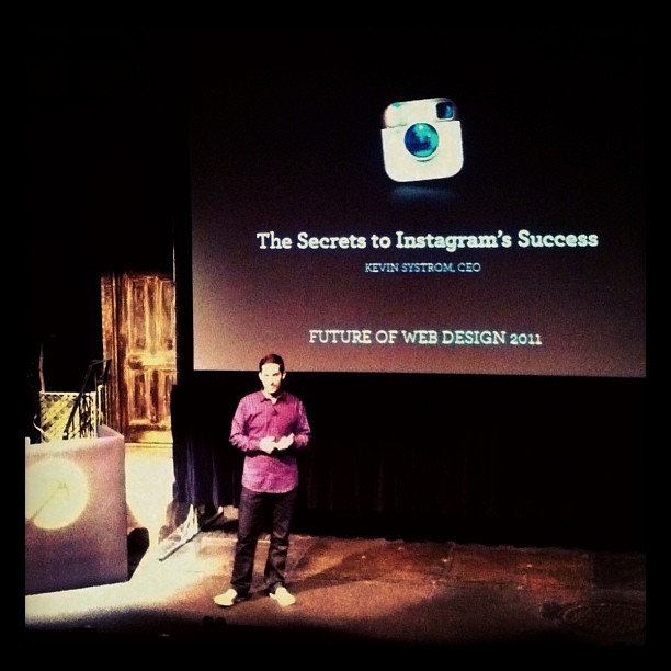
Kevin Systrom kicking off the Future of Web Design
Have a vision
Some of the greatest products get written off as “silly features”. Developing a mission statement can help you take those silly features and project them into the future.
Make it fast – hide latency!
Working at Google, Kevin learned that Gmail starts loading your mailbox information before you even enter your password. Instagram starts uploading your photo before you’ve entered the meta deta and sharing settings. This has a cost. Instagram’s Amazon EC2 bill is about the amount of “2 really nice cars per month” but it makes the app much more enjoyable.
Make it simple
Ask yourself what the trade off is between Simplicity & Flexibility. Instagram is intentionally more simple than an app like Camera+ that’s more flexible. Another thing to think about: chart how the payoff increases with time spent.
Make it magical
If we didn’t have our filters, your friends would just look at the photos you share and say, “oh it’s a photo”. You want them to ask how you did it.
Make it grow
Users have this problem – how to quickly share moments across all their social platforms. Instagram had a business need – to market their product. Instagram acquires 1.5 new users per second!
Make it addictive
Think about slot machines. The science behind slot machines is all about schedules of reinforcement. If you want to get people to keep doing something, you have to know how often and at what ratio the user should win. Variable ratio creates the highest amount of activity. Likes on your photos is like that.
How (And How Not To) Get Hired – Marketing For Web Designers
Andi Graham – @bigsea
How Not to Get Hired
- Make sure we can find you in plenty of compromising photos.
- Let everone know you’re *too good* to do the work that needs to be done.
How to get Hired
“Realize that you’re a piece of a puzzle that’s going to help me prove to my customers that our company is reliable, credible & can get the work done.”
- Make sure your portfolio & website are up to date.
- Determine your rates and for whom you want to work.
- Agency work is easier to find, pay less and are less of a hassle.
- Client work is harder to find, pays a little more but is more of a hassle.
Want to work for an agency?
- Send out your links to all of them.
- Attend industry events, meetup, barcamps.
- Find internships.
- Make friends.
Want to work directly with clients?
- Join professional networks.
- Read your local and industry publications.
- Do pro-bono projects for non-profits.
- Make friends.
Either way:
- Use your resources: dribble, linkedin, authentic jobs, behance, odesk, twitter, freelance switch…and even craigslist. “Craigslist is a treasure trove of people & companies that don’t know where to turn for web design work.”
- Start a blog
- Attend meetups & events – “I have 2 kids & a husband who’s a professor and it’s difficult to make it to industry events and every time I go I get new resources, meet new people & learn how important it is to get a babysitter.”
- Follow people you want to work with and engage them.
How to get hired AGAIN
- Make it easy for people to refer you. Give business cards to your clients and make them look really really great.
- Offer incentives for referrals. It’s not a comfortable practice but it works.
- Make sure people know you’re available. For example, use “Hire me” instead of “Contact Me” on your site.
- Be your own biggest fan. Be proud but not egotistical about your work.
- Embrace your weaknesses. Don’t take jobs that rely on your biggest areas of weakness.
- Become an expert at something & own it.
- Bill hourly & honestly.
- Most importantly: Do good work – meet your deadlines and make youself available.
Wonderful Delightful Web App UX
Lis Hubert – @lishubert
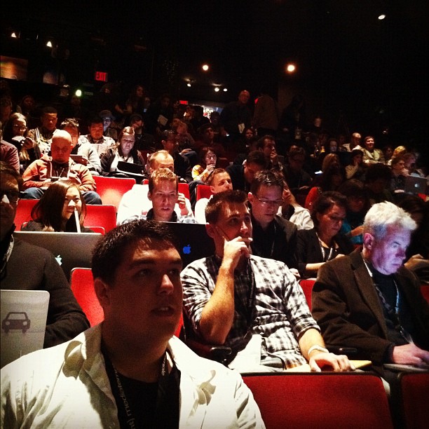
Crowd at stage 2 before Lis’ talk.
We’re not just doing UX to create a usable interface. We’re doing it to elicit a response from our users. From simply completing a task (app is usable) all the way to an emotional response (app is usable or delightful).
Web apps (as opposed to desktop apps) more closely match user exceptions because they work in any context. The problem is that the web app ux environment is chaotically changing with technical advancements & conceptual shifts. Yet…we’re still using old and archaic ways of thinking about your users.
- Solution 1: Know the technology.
- Solution 2: Know your customers.
- Solution 3: Match those 2 things together.
This is UX 101. Essentially we need to understanding behavior.
Knowing what people think isn’t possible. Watching what they do & say can help figure that out. Getting that understanding of what people think helps us to match their needs to the technology we understand.
History of objectives:
- era of the page (pre app)
- get apps online
- make more usable
- influence behavior
To get people from just having usable web apps, we need to change our way of thinking. We need to stop using our understanding and methodologies from the era of the page & stop telling people that we make things easy to use. We need to tell people we understand user behavior. This is about psychology.
The old school phone underwent a similar evolution:
From the old crank phone, to the dial phone to the small, more portable (wired) handset, phones went through an evolution from simply working, to becoming more usable to being loved.
Don Norman (Author of “Design of Everyday Things”) knew that he was ahead of his time. He knew product design was about influcncing behavior. Usability was simple scaffolding to get there.
The merger of psychology and user research is the next frontier.
The future is now!
Web Design is a Cloud, Not a Clock
Sarah B Nelson – @sarahbeee
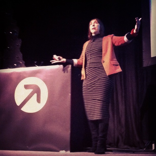
Sarah Nelson takes the stage.
Sarah spent a lot of her life studying the behavior and patterns of groups of people doing creative things together.
The frightening and most difficult thing about being what someone calls a creative person is that you have absolutely no idea where your thoughts come from and you have no idea where they’re going to come from tomorrow.”
– “Art & Copy” Documentary
The language of business ends in periods and exclamation marks & the language of creatives ends in question marks and commas. Business people often try to make bad assumptions about creative workflows like:
- Official workflows ensure great work.
- Everyone should use the same tools.
- If we diagram our workflow and give it to everyone on the project it’ll run smoothly. It’s a great exercise to understand but not to shape behavior.
- Bosses make the processes.
Of Clouds and Clocks – Great book by Carl Popper
Clock problems are knowable – you measure them, you can rebuild them, but we know what they do. It’s tangible. A lot of what we do with web design is solve clock problem. How to build a form and make it validate.
Cloud problems are dynamic – you can understand the patterns of cloud behavior and make predictions but we can’t really pick it apart or nail it down 100% of the time. The problem is that when we often treat cloud problems like clock problems.
The design process is an emergent system. Set working agreements, not a 3 page process diagram for the creative process. For Sarah, working agreements are the heart of collaboration. Example set of working agreements:
- Have a clear purpose – set design principles for the team to rally around.
- Trust – make a promise and then deliver on it. Failure is inevitable with creative tasks. It should be an opportunity for growth.
- Clear roles and responsibilities – Let people know what they’re accountable and let them change roles from time to time.
- Agreed-upon approach – Set realistic expectations and deadlines. Deadlines (in creativity) force us to turn things upside down and get things done. If it’s a long project, re-evaluate your approach.
- User involvement – A lot of people talk about their users like they know what they think. Teams should have regular contact with their customers and react to feedback.
- Stakeholder engagement – We need a more sophisticated way to get information from stakeholders and get the involved in the project. Have a workshop with them.
“One of my creative team members told me in a meeting, ‘Just because you wrote those roles on the board, doesn’t make them true.’ Whoa!” His assumptions about the project and his responsibilities were dramatically different. That’s why she makes working agreements. Not to nail down a process but to make the environment so that good things will emerge.
Type on Screen: Choosing and Using It Well
Daniel Rhatigan – @ultrasparky
Screen typography has come a long way, but it’s still evolving. There are Licensing issues, device support issues, font rendering inconsistencies and not all fonts work well on screen. Rasterizing software and screen hardware (lcd, E Ink) take different approaches.
Choosing a typeface:
- Vertical Proportions – Most web safe fonts have similar proportions between upper and lowercase text. A taller x-height can make the text feel more dense at the same size.
- Shapes – Straight lines and clear forms work better than subtle angles or curves. At small sizes, good hinting can help keep these details from causing trouble.
- Open Spaces – Generous spacing within and around letters (within apertures and around forms) will increase legibility at small sizes.
- Family Selection – Makes sure that italic and bold styles look as good as the regular.
- Opentype Features – Support is beginning to increase. Ligatures, alternate number forms, swashes or contextual alternatives and real small caps.
Using it well:
- Compensate for inconsistency – Adjust the size and line-height as needed to get contrasting fonts to work together.
- Be generous – If in doubt, slightly larger text size & extra line spacing will be easier to read.
- Choose color carefully – Contrast between text and background not only makes text more readable, but it also makes fonts easier to rasterize. More steps between the colors.
We need E Versions of popular print faces:
E Versions of Bembo and Helvetia Neue are available. Adjustments to the weight, proportion and spacing.
New faces being created specifically for screen like Malabar.
The Power of Side Projects & Eccentric Aunts
Tina Roth Eisenberg – @swissmiss
Lessons I Plan to Teach My Kids
- Love what you do.
- Trust your intuition.
- If an opportunity scares you, you need to take it.
- Don’t be a complainer: make things better or let them go.
- Make time for side projects.
- Surround yourself with likeminded people.
- Ignore haters.
- Seek to inspire others.
Pith Passion Productivity
Cameron Moll – @cameronmoll
Pith
It convey knowledge & personality. Cameron has done a lot of writing in the past: Wicked Worn Look series, CSS Mastery, Mobile Web Design (sold ~7k copies). On his blog, he currently posts a lot of links. “When I start editorializing the things that other people are doing, I lose my pithyness.”
Read: Editing Tips for Designers – Cennyd Bowles
How can I make a name for myself?
Write! …with pith, authenticity, persistence & passion.
Who’s A-Game Pithy?
@fictivecameron – Gimme Bar – “It’s basically an Internet Sham-Wow”
@etherbrian – Tweets are always exercises in creative writing.
Passion
“The details are not details, they make the product.” – Charles Eames
Cameron’s Colleseo Poster and Authentic Jobs both started out as pursuits of passion.
Who’s A-Game Passionate: Dave Shea about cycling, Aarong Gustofson about gardening, Ryan Carson about making and keeping friends. We have things outside of work that we’re passionate about.
Do and write about things you’re passionate about.
Productivity
“We have a strategic plan. It’s called doing things.” – Herb Kelleher (co-founder of SouthWest airlines)
Read: “Grit Is More Important Than Talent – Jocelyn K. Glei (the99percent.com)
Look for ways to get the most out of your time. Cameron uses an app called Sorted each morning out morning, afternoon & evening tasks.
Don’t get discouraged by failure.
“Have I produced anything meaningful that would warrant me standing up on stage and teaching you anything about design?”
Cameron Moll’s fortune cookie fortune that he keeps in his pocket:
“Today is a disastrous day. If you can’t beat’em, join ’em.”
“It is never too late to be what you might have been.” – George Elliot
Principles of Visual Design
Whitney Hess – @whitneyhess
Contrast, Emphasis, Variety, Balance, Proportion, Repetition/Rhythm, Movement, Texture, Harmony, Unity
Consistency. Constrains. Shared vision. Objective evaluation.
Good design != Good experience
Examples: Apple G4 Cube – House of Representatives
Good Design Can = Good Experience
Principles of Experience Design:
- Stay out of people’s way.
- Create a hierarchy that matches people’s needs.
- Limit distractions.
- Provide strong information scent.
- Provide signposts and cues.
- Provide context.
- Use constraints appropriately.
- Make actions reversible.
- Provide feedback.
- Make a good first impression.